This page presents some main ideas by Jarkko and Jonathan on how the user interface of the
DaCoPAn animator
should work. These ideas are of course open for discussion.
Problems with current ideas
In earlier discussion we have been thinking that the animator should control the animation
in a strictly predefined way so that it would force the user (student) to see some aspects
of the animation. Even though this is good in some way, it has some quite severe problems.
That's why we thought that a different approach would be better and satisfy the requirements
while removing most of the problems.
- First, if we are using pre-defined "scenarios" that control variables, tell where to
show encapsulation etc., we definately will need some way to record (and edit) the
scenario. Doing this with full-blown scenarios as planned will force us to do a lot
of work, or to make our editor not as good as we would like it to be.
- Second, there are the problems with different "time lines" and the user doing changes and
then continuing with the predefined animation. There is a requirement saying that
the user should be able to change the visible layer during showing the animation. This
combined to fully pre-defined scenarios leads definately to problems, and if it is possible
(and it is), we should try to avoid this situation.
Actually we need to remember that the scenario file "requirements" aren't really required by Mr. Kojo,
but something we have created by ourselves. This really isn't an issue, I just
wanted to mention it here so that we wouldn't think it is something that we should stick to
just because we think he wants it.
The new suggestions
We suggest that there would be a scenario file as discussed earlier. But it would be less controlling
and simpler than what we have been discussing before the meeting with Jonathan and Jarkko where this
idea came up.
The main idea in this new approach is that the animator would not force the user to do anything but
instead give more freedom to the user. This means that the scenario would only hold the following
data:
- The default variables and header fields for each layer
- Breakpoints and notes (which would probably be one thing)
The user would then be free to look at any layer he wants and that wouldn't create any problems with
the scenario "flow". And actually this is what Kojo wanted in the first place: to be able to
explore the events happening in the network data and have full control over it!
Encapsulation is quite simple as well: the user just selects the encapsulation he wants to see,
and it is then shown to him.
Then as an extra bonus that comes with this approach everything can be changed on the fly! There
is no longer any need to restrict changing variables to be shown on the screen. Of course the
teacher would save his default fields to the scenario, but once again, if the student would
change them, that wouldn't mess the animation!
So, in short: The guiding principle in our approach is that the user uses the animator to
explore the events happening in the scenario file. This means that the user would be in control and not the animation.
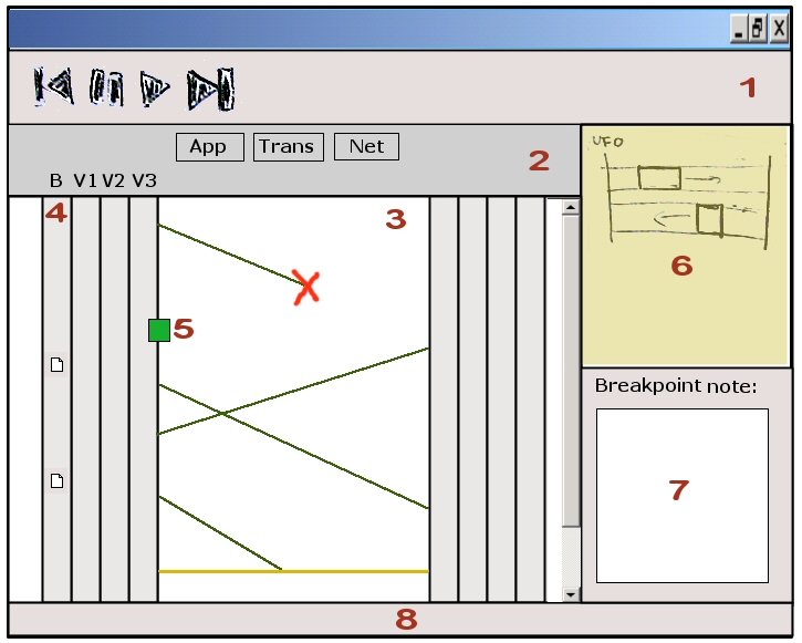
The following picture shows the main view of the
DaCoPAn animator. It is just a sketch so the actual
sizes of different parts of the window could be very different from this. Below the image different
aspects present in it are described. (You can view the actual blackboard sketch by
clicking here).
As you see in the picture, the main view would be an MSC animation that can be accompanied with
UFO and/or TPI. From this view the user can then change to ENC animation by just selecting some
encapsulation-decapsulation pair, or put in other words, a transfer unit to be ENC-animated.

1: Toolbar
The animation is controlled from the toolbar. It could contain the following buttons:
- Open animation/protocol events file
- Reset animation: could mean just rewinding it to the start or actually loading
the default "options".
- Pause: change the animation mode to stop/scroll
- Play: Start animating the network traffic. If the user doesn't do anything else
than press play, the animation is shown to him as an MSC animation with default
options loaded from the scenario, of course pausing on breakpoints.
- Jump to end
- Step forward, step backwards (can only be used in stop/scroll mode)
As you can see, this part is actually almost the same as discussed earlier. The only
difference is that the animation won't automatically change from MSC to ENC and back. This
is something the user has to do by himself, but of course the teacher still can add notes
saying "now would be a good time to check the encapsulation - or something like that" :)
2: MSC "Options" and "Controls"
Here you have radio buttons for selecting the visible layer and some means to select
the host variables that you want to be looking at. All this configuration can be done
on the fly as it really doesn't differ at all from just doing it in pause mode. Of course
when you change the variables, the animation is paused automatically so that you won't miss
what's happening in the animation.
3: MSC Drawing area
This is the same thing as discussed earlier. The only difference would be that you can
somehow (for example by double-clicking - or using a pop-up menu) select some transfer
unit to be shown as an ENC animation.
4: Breakpoint column (and other variable field columns)
These are the host variable columns that are already documented in the requirements
specification. Our addition would be to add the possibility to choose a
comment / breakpoint column as one of them.
This column would allow the user to select any comment and see, what is said in it
any time, but probably only when the animation is in stop/scroll mode. It would also
allow the user to easily add breakpoints/comments by just double-clicking on it.
The text from the comments would be shown and edited in (7)
5: Interesting events (e.g. ARP lookup)
Kojo seems actually to be quite keen on the point that he wants us to visualize ARP and
DNS lookup which both include third parties. The best way we think this could be done is
by just showing some kind of event markers accompanied with comments saying for example
that "an ARP lookup occurred" and some information on what it actually is. One way to
show it would be something like box on this sketch.
6: Additional animation area
On this area the user could choose to show or not to show UFO and TPI animations. It
would be completely up to him, so that if he thinks they are useful or fun, he just turns
them on and otherwise off. This can also be done on the fly.
7: Note area
Notes will show up here.
8: Status bar
Well, you all know what a status bar is for :)
This is just a rough sketch, but I actually am quite convinced that this approach in general has
many advantages over the completely scenario-driven one. It gives the user more freedom to do
what he wants, makes editing the scenario easier (the teacher only needs to create breakpoints and
set the default variable fields) and best-of-all removes many of the difficult issues we would
otherwise need to try to conquer. :)
--
JarkkoLaine - 12 Mar 2004

